After talking to cafe goers, brainstorming, storyboarding design ideas, speed dating for feedback, and creating sketches, we arrived at Watercolor, a ubicomp cafe. Through the interactive tabletop displays, patrons have the chance to utilize a painting program, create a drawing, and add it to the stream of art that flows throughout the cafe’s wall and table displays.
Whether actively creating something to show the cafe or sipping coffee only watching the artwork go by, Watercolor is meant to be a comfortable and relaxing place that gives people the chance to express their creative side. To the right is a video sketch that we created to detail an interaction in this proposed cafe. Please see below for the process behind Watercolor’s design
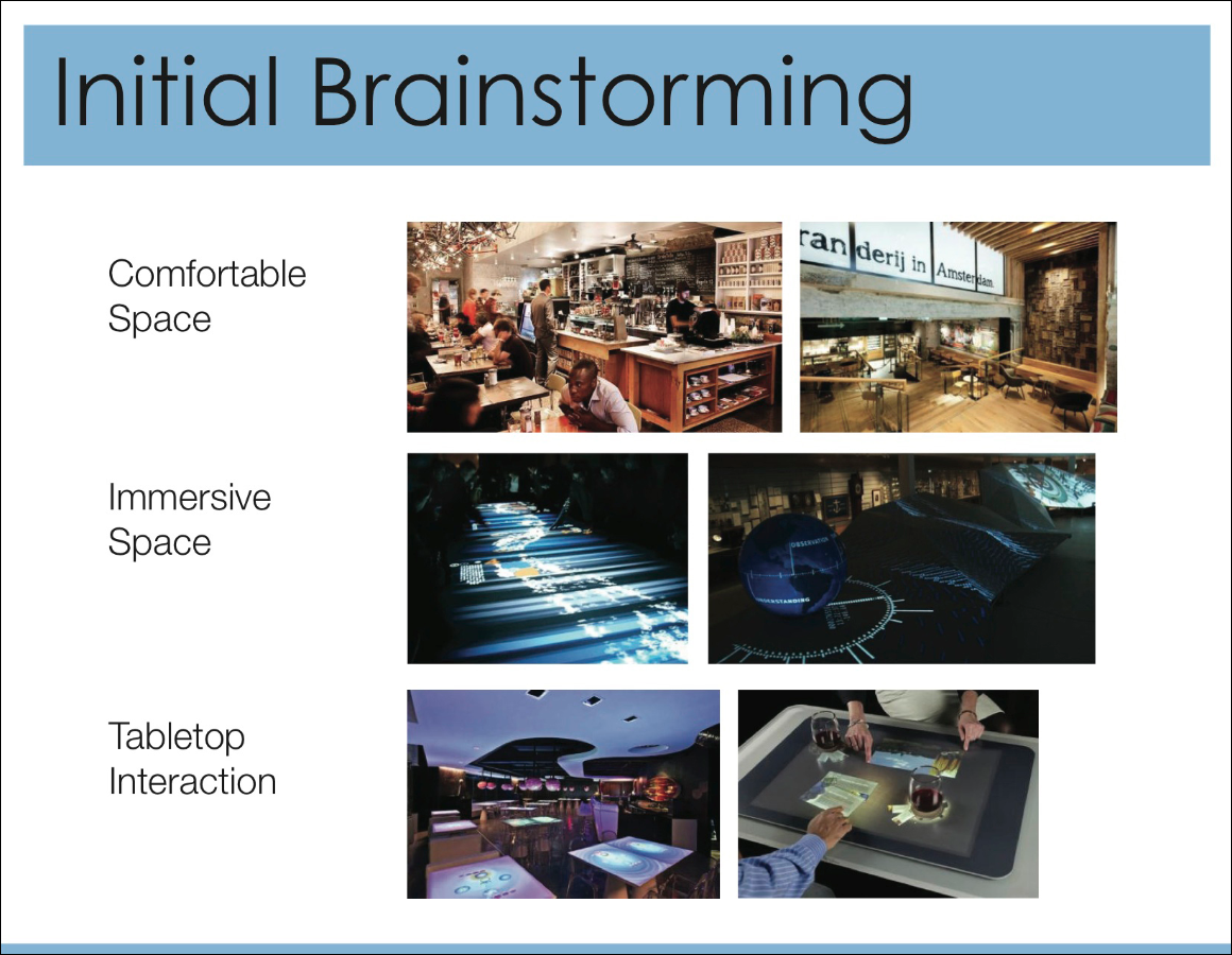 Initial Brainstorming:We first began by thinking about what we aspects of the cafe were important to us. With cafes being used for a range of reasons besides just getting coffee (eg. studying, meeting friends) we decided a comfortable environment should be a priority. As a part of the task, technology was supposed to be utilized. In our minds we immediately thought about the power of an immersive space, especially with the requirement to ‘project a digital self’ into the place. People want to contribute and see their contribution and to us that meant some way to aggregate everyone’s digital self into one very large display. Finally, we thought that a good place for the interaction to occur would be the tabletop because of all the underutilized real estate.
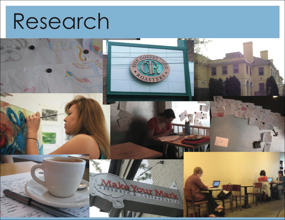 Research:With these three ideas guiding us we began to do user research. We went to two local cafes and spoke with both employees and cafe goers. We asked about what they wanted from a cafe, why they went to cafes, and other related questions. At one of the cafes, colored pencils and paper were present so that patrons could come in and draw pictures that they would then post on a wall. We thought this was an interesting idea – art as a statement of a person’s identity, being left in the cafe for other people’s enjoyment.
This sparked us to take to artists at a local art school, and we continued researching by asking them about what art means to them, where they sketch, how they feel about sharing their work, etc.
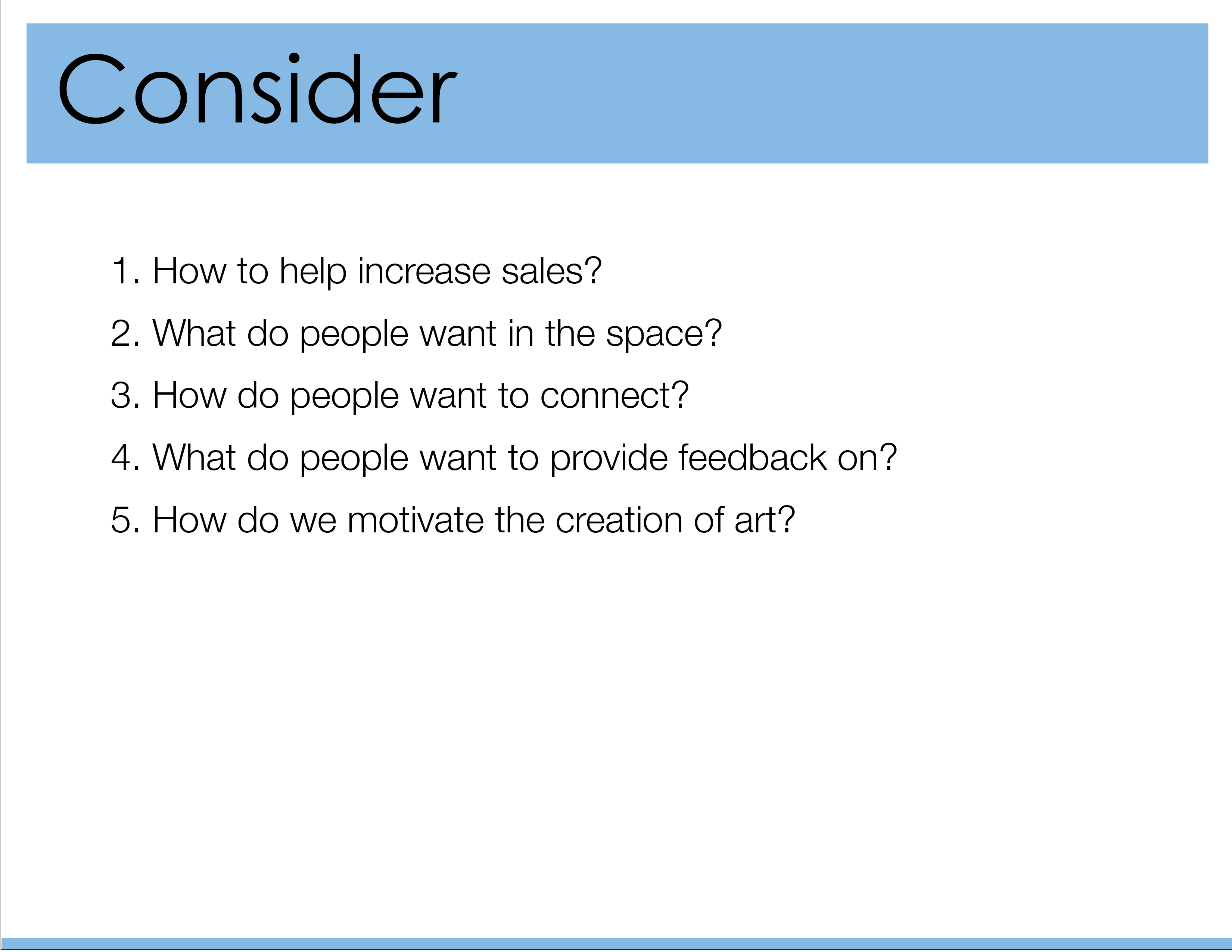 Brainstorming Ideas:We really took to the idea of using doodles and drawings as a way for people to express themselves and decided that we wanted our cafe to encourage creativity. We next needed to brainstorm ideas that would integrate creativity and the cafe and based our concepts around 5 questions (seen at left). The questions were utilized to help ground our idea generation in essential parts of the cafe experience with the hope that what was generated would be something cafe patrons would want to utilize.
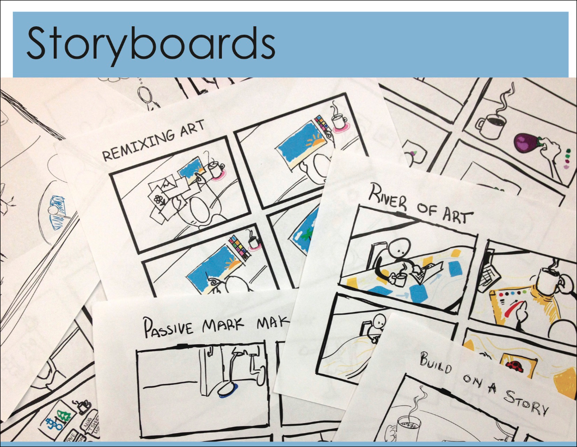 Storyboards:After creating many ideas we went back through the list, combing and discarding various ideas. We then selected the strongest ideas that we thought we could build a cafe around and began to storyboard interactions. Many of these interactions centered around creating art in the cafe in some way.
Here I was responsible for creating a few of the storyboard sketches.
 Getting feedback:Once the storyboards were created we did a Speed Dating activity, where we presented the storyboards to people to get quick feedback on what they thought about the idea. To the left are general considerations that we kept in mind while moving forward in the design process.
I found that while I was speed dating with users, they tended to appreciate the idea of integrating a painting system into the cafe experience. They cautioned me that they were “bad at drawing” and may not participate in the activities we were suggesting, but also said that the environment that would be created would be an enjoyable one. From this it was apparent that different levels of interaction would be needed, to allow “non-artists”, doodlers, and artists to contribute.
 Concept Storyboard (Part 1):
Here, the storyboard is detailing the heart of our idea. One cafe goer is seen to be using the table’s interactive display to draw a picture. Meanwhile, other people’s art is floating by underneath the canvas workspace, almost like a flowing river. When he’s done he sends the piece into the river and later sees his drawing on the wall display. In that way the cafe will become decorated with the drawings created by its customers.
 Concept Storyboard (Part 2):
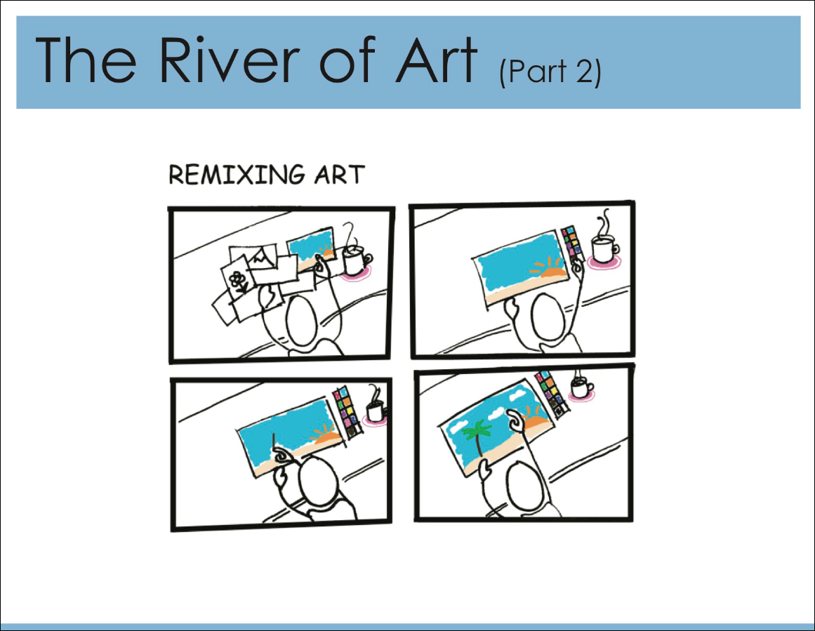
At left is a storyboard I sketched detailing another type of interaction. We also envisioned a feature where instead of people creating a completely new drawing, they could select another person’s drawing and choose to add to it and iterate upon it. This would encourage people (who feel less comfortable drawing) to contribute. It would also be less time consuming, which may appeal to some customers.
Similarly, we also discussed adding features for voting and commenting on pieces to allow people to get feedback on their drawings. These types of interactions would also encourage more participation, especially since people who may not want to contribute may still be interested in looking at the drawings.
 Concept Sketches (Part 1):
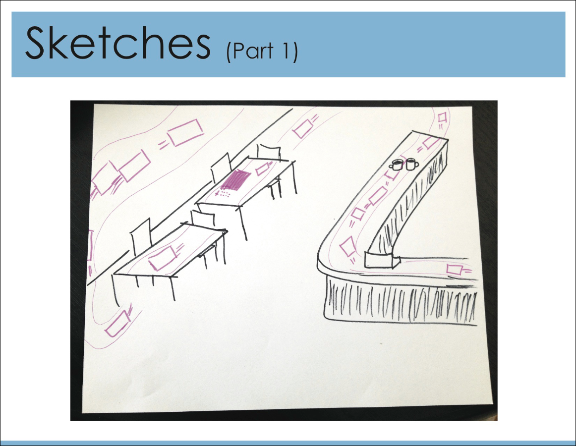
With a videosketch as the goal for the project, we began to flush out our idea with sketches. Here are a few that I made detailing different aspects of the concept. This sketch shows how the different tabletop and wall displays are really a part of the same stream of art, all flowing in one direction and at some point the end, rejoining the beginning so that the art just cycles around. In some areas, floor projections will also be integrated.
We envision that if people find this distracting they can hide the flow from their tabletop. That way, this interaction isn’t detracting from the cafe environment. The River of Art exists if patrons want to engage.
 Concept Sketches (Part 2):
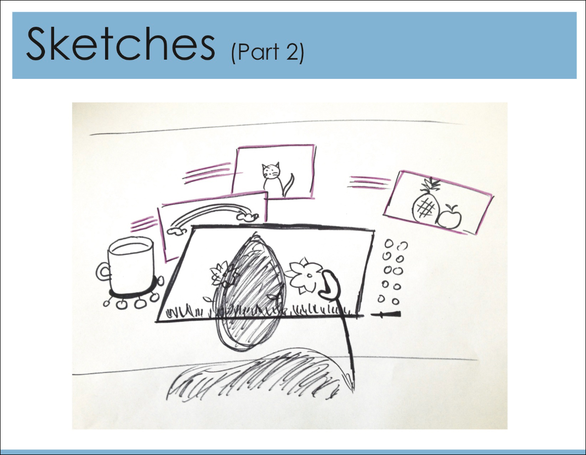
Here we discussed the notion of the coffee mug acting as a menu system, with various drawing options extending around it. Besides having the option to create a new drawing, one idea was to embed different drawing tools in menu system.
 Concept Sketches (Part 3):
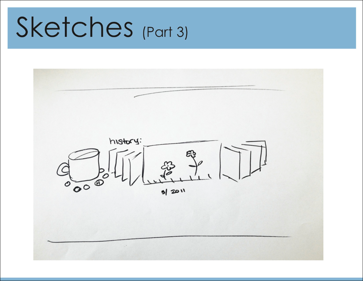
To extend the concept further we also discussed a way for a person to access all of his/her past drawings and be able to go back through them. That way regulars have this other available interaction where after some time they have generated a collection of drawings that they can go back through themselves or show to their friends. Access to this option could be a part of the coffee cup interface.
As can be expected, logistical questions like how to ensure the art content is appropriate and for that matter what is appropriate as well as questions about system maintenance must be considered before the implementation of this idea, but these logistics existed outside the scope of the project.
